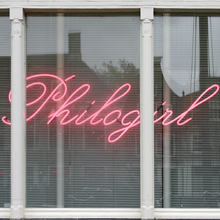
Cut in-house at Stempel in 1901–1903 and issued as
Künstler-Schreibschrift
(“artist’s script”) in three
styles: mager, a slightly bolder halbfett, and schmal (condensed).
Comes with several ligatures, fitted pairs, Roman numerals, and
alternates for ‘erstzIMT’ [DIN 16507 index cards] [
Wetzig 1926–40
] and ‘k’ [
glyph
set
]. The mager is based on a design from Deberny. The two
weights of regular width were also available with Cyrillics
[
Wetzig 1926–40
].
Also carried by Scholz, Klingspor (as
Cabinett
, sold abroad as
Cabinet
,
2
weights), and Simmelkiær
(as
Selandia Skriveskrift
, 3
styles). [
Reichardt 2011
]
In 1958, Stempel added a fett weight designed by Hans Bohn, see
Künstler-Schreibschrift (Bohn)
[
Reichardt 2011
], which was later extended
into a lighter weight. The old styles exhibit several design
differences in comparison to Bohn’s version:
More…
Cut in-house at Stempel in 1901–1903 and issued as
Künstler-Schreibschrift
(“artist’s script”) in three styles: mager, a slightly bolder halbfett, and schmal (condensed). Comes with several ligatures, fitted pairs, Roman numerals, and alternates for ‘erstzIMT’ [DIN 16507 index cards] [
Wetzig 1926–40
] and ‘k’ [
glyph set
]. The mager is based on a design from Deberny. The two weights of regular width were also available with Cyrillics [
Wetzig 1926–40
].
Also carried by Scholz, Klingspor (as
Cabinett
, sold abroad as
Cabinet
, 2
weights), and Simmelkiær (as
Selandia Skriveskrift
, 3
styles). [
Reichardt 2011
]
In 1958, Stempel added a fett weight designed by Hans Bohn, see
Künstler-Schreibschrift (Bohn)
[
Reichardt 2011
], which was later extended into a lighter weight. The old styles exhibit several design differences in comparison to Bohn’s version: smaller x-height, smooth joins, diamond-shaped dots, ascending ‘p’, pointed ‘A’, descending ‘G’, ‘Q’ tail above the baseline, ‘X’ with loops and no crossbar.
Mecanorma’s dry-transfer version was named
Art script
(licensed from Linotype). It was digitized as
Classic Script
. More digitizations of the halbfett include
Kuenstler Script No.2 Bold
(Adobe) a.k.a.
Kuenstler Script #2 Bold
(Linotype), both with diamond-shaped dots like in the metal original, and
Kunstlerschreibschrift D Medium
(URW) with round dots.
Related Typefaces


