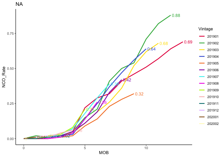
You can filter the data within
geom_text
to keep only the row with the highest
MOB
value within each
Vintage
. The plot is still pretty cramped though:
colors = c("#e6194b", "#3cb44b", "#ffe119", "#4363d8", "#f58231",
"#911eb4", "#46f0f0", "#f032e6", "#bcf60c", "#fabebe",
"#008080", "#e6beff", "#9a6324", "#fffac8")
ggplot(data=curves, aes(x=MOB, y = NCO_Rate, colour = Vintage)) +
geom_line(aes(), size=1) +
labs(title = "NA") +
theme_classic() +
scale_color_manual(values=colors) +
geom_text(data=. %>%
arrange(desc(MOB)) %>%
group_by(Vintage) %>%
slice(1),
aes(label=NCO_Rate),
position=position_nudge(0.1), hjust=0, show.legend=FALSE)